Genuinely Historic Vintage Coca-Cola Logo from 1890
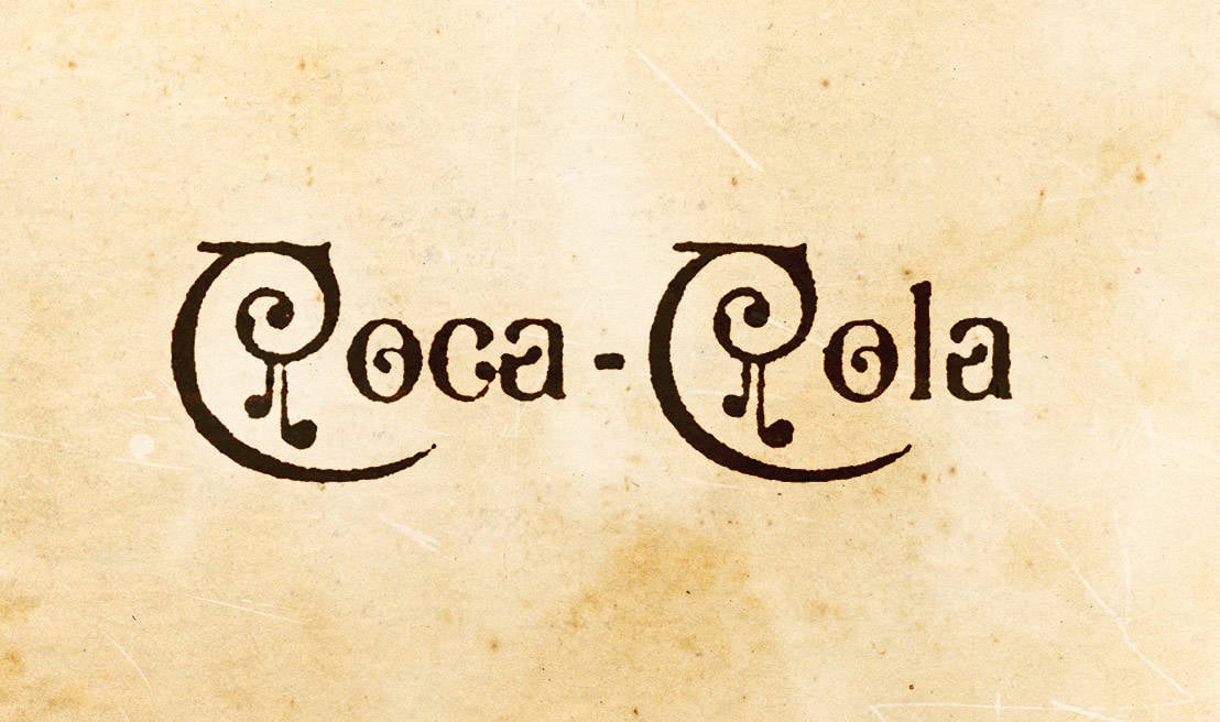
 Totally love little logo trivia bits like this. Not sure I’ve actually seen, and took notice, of this particular design before, yet this version of the Coca-Cola logo was only designed, and used, for one whole year: 1890-1890.Notice the adorable extra swirls and other fancy adornments. Awwww just so cute.
The previous Coca-Cola logo designed before it, even way back then, was more like the logo in we know and ‘love’ now. Interesting, that for just this one year, the logo would changed so significantly before quickly reverting back to the familiar script used now. What was the reason? Who was responsible? Was it a planned and temporary novelty-style logo where they always planned to revert back to the first style? So many questions.
With today’s mentality (talking here about the importance of keeping ones brand image consistent, and not throwing it down the drain with hastily and ill considered changes), it might be too easy to look upon such radical, and short-lived, logo redesigns with shock and horror: how dare such a big company play so fast and loose with their company logo? I’m only 41 so it’s a little hard for me to imagine how people back then viewed such changes—possibly made with such reckless abandonment—and might be fair to assume they simply didn’t have the benefit of experience that we have now some 2000 million years later.
CreativeBloq: In 1890, a version of the logo was created and used only once, on the first calendar ever printed by the company. It features a style heavily reminiscent of musical notation and wholly out-of-kilter with the logo we know today. The creator of this design is unknown, but they certainly brought an unusual feel to the lettering.
It wasn’t until 1893 that the first iteration of the logo we recognise today was unveiled. A slightly thinner rendering of the words Coca-Cola coincided with the company’s early growth. Asa Candler had acquired the brand from Pemberton and the strategy was to outfit chemist shops with soda fountains. At this time syrup plants were built in Chicago, Dallas and Los Angeles.
Source: http://imjustcreative.com/genuinely-historic-vintage-coca-cola-logo-1890/2013/12/16
O menos conhecido logo da Coca-Cola


Nenhum comentário:
Postar um comentário