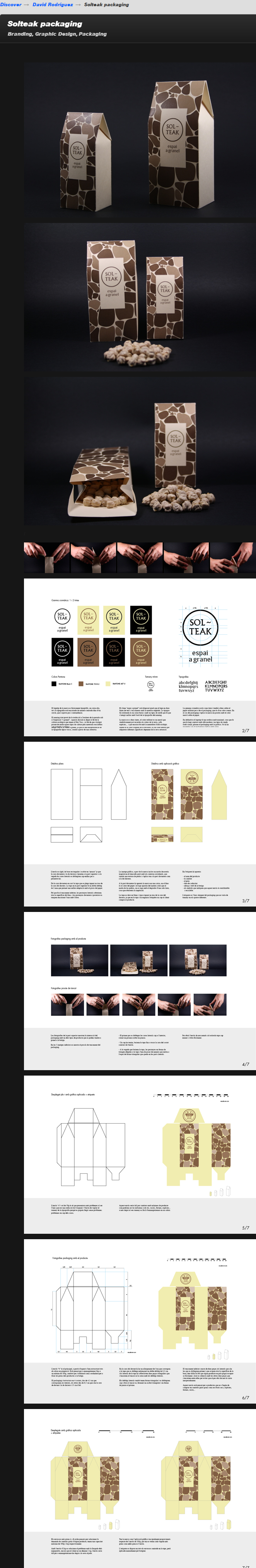
source: https://www.behance.net/gallery/Solteak-packaging/13121003
Muito legal a solução visual desta embalagem multipurpouse...
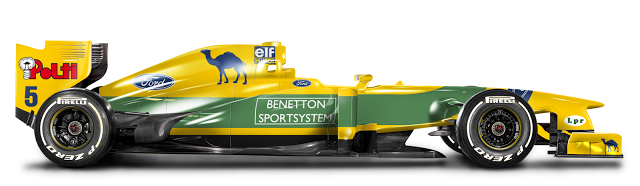
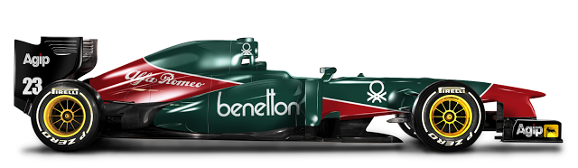
Em um carro atual… muito bacana o trabalho de Camille De Bastiani:
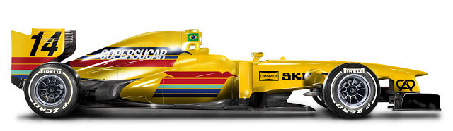
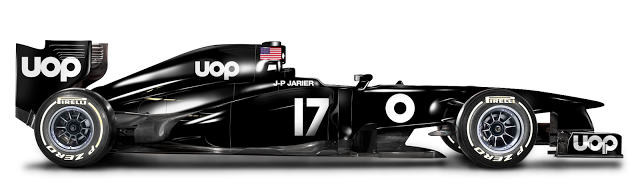
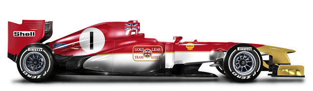
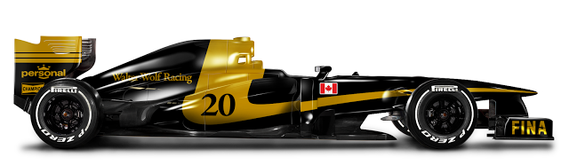


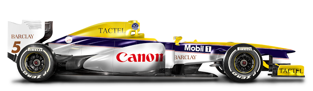

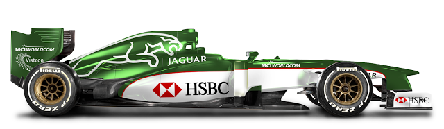
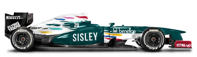


Mais em: http://cdebdesign.blogspot.fr/
“O vermelho intenso e o ouro que fluem para fora da garrafa produzem uma atitude positiva e dinâmica, que causa na pessoa que observa uma sedução irresistível no momento da compra.”
– Nossa! Que vontade irresistível de comprar esta cerveja!
.jpeg)
Designed by Pierini Partners, Argentina.
Pierini Partners surprises with a “caleidoscopic” metallic bottle for Paraguay´s Brahma
Without doubts, one of the more remarcable characteristics of Paraguay´s brand, is the effort of giving the best to their consumers, both in flavor as in creativity and technology. This is shown in the recent launching of an original mettalic bottle, which has more chilling speed in compare with the glass ones, and enters to the market thanks to its innovative layout base on geometric shapes wich emits different glitter intesities.
The packaging design was in charge of the recognized argentine studio Perini Partners. Its general creative director, Adrián Pierini made a remark about this launching: “The main objective was to surprise, that is to say, create an esthetic wich could exceed the things already known and that it could turn into a symbol of the innovative spirit of the brand”.
The result was achieved. The intense red and the gold wich they flow out from the bottle produce a positive and dynamic attitude, that causes in the person who observs it a seduction imposible to resist at the time of buying it.
.jpeg)
Source: http://www.packagingoftheworld.com/2013/12/brahma.html
 Totally love little logo trivia bits like this. Not sure I’ve actually seen, and took notice, of this particular design before, yet this version of the Coca-Cola logo was only designed, and used, for one whole year: 1890-1890.Notice the adorable extra swirls and other fancy adornments. Awwww just so cute.
The previous Coca-Cola logo designed before it, even way back then, was more like the logo in we know and ‘love’ now. Interesting, that for just this one year, the logo would changed so significantly before quickly reverting back to the familiar script used now. What was the reason? Who was responsible? Was it a planned and temporary novelty-style logo where they always planned to revert back to the first style? So many questions.
With today’s mentality (talking here about the importance of keeping ones brand image consistent, and not throwing it down the drain with hastily and ill considered changes), it might be too easy to look upon such radical, and short-lived, logo redesigns with shock and horror: how dare such a big company play so fast and loose with their company logo? I’m only 41 so it’s a little hard for me to imagine how people back then viewed such changes—possibly made with such reckless abandonment—and might be fair to assume they simply didn’t have the benefit of experience that we have now some 2000 million years later.
CreativeBloq: In 1890, a version of the logo was created and used only once, on the first calendar ever printed by the company. It features a style heavily reminiscent of musical notation and wholly out-of-kilter with the logo we know today. The creator of this design is unknown, but they certainly brought an unusual feel to the lettering.
It wasn’t until 1893 that the first iteration of the logo we recognise today was unveiled. A slightly thinner rendering of the words Coca-Cola coincided with the company’s early growth. Asa Candler had acquired the brand from Pemberton and the strategy was to outfit chemist shops with soda fountains. At this time syrup plants were built in Chicago, Dallas and Los Angeles.
Source: http://imjustcreative.com/genuinely-historic-vintage-coca-cola-logo-1890/2013/12/16
4 de Novembro de 2013
À venda, tamanho duplo ofício (A3: 297X420mm) Impressão laser; sem montagem.
Quality & Effective Design + Retro-Vintage Style
© 2013 Portfolio | Theme Tweak by PauloPedott & Plutonium 244
Google
Contact: ppedott(a)gmail.com - Facebook: /PauloPedott
The Moto Guzzi Motoleggera 65 (a.k.a. “Guzzino”) was designed by Antonio Micucci and manufactured by the famous Lombard company from 1946 to 1954.
The model was meant to be a swift and inexpensive means of transportation for Italians who needed to get to work every day in those challenging post-war years.
Easy to drive and weighing in at only 45 kilograms, the Guzzino – with the addition of a fairing to reduce drag – was also a great vehicle for sport competitions and record-breaking performances. In 1948, on the road between Charrat and Saxon in Switzerland, it set the world speed record over the kilometer and the mile; later in the same year, it set another 19 records at Monza’s racetrack.
The Guzzino kept going faster and faster as the years went by. It was restyled more than once, finally coming close to resembling a rocket: pilots had to ride in a position known as “the frog”, with their knees around the fairing that protected the chain, and their feet on the foot boards on the back of the frame.
By the time production stopped in 1954, almost 72,000 Guzzini were zooming around in the streets, in Italy and abroad: for 10 years it was the best-selling “motoleggera” (the Italian term for motorbikes under 100cc) in Europe.
Another record, for the record-breaking Guzzino.
Photos via www.museoscienza.org
www.motoclub-tingavert.it
1st March 1949: Italian motorcyclist Raffaele Alberti at speed on his strange-looking 75cc Moto Guzzi during his successful attempt at the world motorcycle speed record, on the road between Charrat and Saxon in Switzerland. (Photo by Keystone/Getty Images)
Source: http://www.italianways.com/the-record-breaking-guzzino/

Designed by Cruce design group, Uruguay.
Cruce design group has recently designed a set of three cookie tins decorated with past popular sayings for the brand Solar which belongs to Mondelez International.


Source: http://www.packagingoftheworld.com/2013/12/solar-cookie-tins.html

The Los Angeles City Council ruled last week to give landmark status to Johnie’s Coffee Shop, a blue-and-white striped diner in the city’s Miracle Mile district. Opened in 1956, the building’s dramatic angles and flashy neon made it a darling of L.A.’s newly car-centered culture.

Romeo’s Times Square by Armet & Davis, 1955. Pencil on paper. Collection of Armet Davis Newlove Architects from the Getty’s Pacific Standard Time Presents exhibition
Architects Armet & Davis designed plenty of other Googie-style diners in the area, including Pann’s, Ship’s, and several locations of Big Boy. But Johnie’s—originally opened as Romeo’s Times Square—is special, in that it has largely retained its integrity, making it one of the best-preserved Googie-style structures in Southern California. According to the Los Angeles Conservancy, which nominated the building with a statement written by Googie expert Alan Hess earlier this year, it offers exemplary features for the time period, including a “knuckle” roof and an “egg crate” metal texture on the exterior.
But there’s another reason this decision is a big deal, Los Angeles Magazine editor Chris Nicholstells Gizmodo: “There are more than 1000 landmarks in the city of L.A. and this is the first time a Googie building has been included on the list,” he says. “The style was born here, and the optimistic futurism of Googie, with its jazzy rooflines and flashy neon signs, came to define midcentury L.A., alongside the LAX Theme Building, Capitol Records, and the Cinerama Dome.”

Orange and green is always a winning diner combination, photo by Ryan Vaarsi
Its bright colors and period-perfect interiors made it a cinematic darling, and, over the years, Johnie’s has played a role in plenty of movies including Reservoir Dogs and The Big Lebowski.
But what’s kind of amazing is that Johnie’s sat vacant—besides the occasional film shoot, of course—on one of the city’s busiest streets, Wilshire Boulevard, for over a decade. It’s across the intersection from two major museums and it’s surrounded by tall office towers, all of which are filled with workers who would certainly swarm a new lunchtime destination.
The scene is made even more surreal by a giant 99 Cents Only store (which used to own the property) that wraps protectively around it, slyly incorporating some of Johnie’s Googie elements into its own design. The 99 Cents’ owners also used to turn on the lights at night, revealing a dazzling Vegas-quality spectacle of thousands of incandescent bulbs (even if a few were burnt out).

Johnie’s as it looks today, photo by On Location in Los Angeles
As a subway extension is making its way to this intersection, some of the nearby businesses are being uprooted as their buildings are knocked down to build a station. Although it looks like the station will probably be located across the street, how cool would it be to shuffle passengers through a renovated Johnie’s? It would provide a convenient place for commuters to grab coffee and donuts on their journeys, and it would offer the perfect commentary on L.A.’s changing ways: a flashy auto-focused relic, repurposed for a public transit-riding future. [Los Angeles Times]
Top image, Johnie’s in 2000, the year it closed, by Trader Chris.
Source: http://gizmodo.com/l-a-saves-johnies-one-of-socals-best-preserved-goog-1476505756/@mattnovak