Fazendo a nossa parte para colaborar com a erradicação do racismo em nossa sociedade aqui está uma matriz em PDF que pode ser baixada gratuitamente, impressa em um transfer e aplicada em qualquer camiseta ou moleton (as instruções de como fazer estão no link)… Se você curtiu, compartilhe para que outras pessoas possam também utilizar!
Link para baixar: http://paulopedott.com/ideias/designstore/produtos/pdf-warhol/
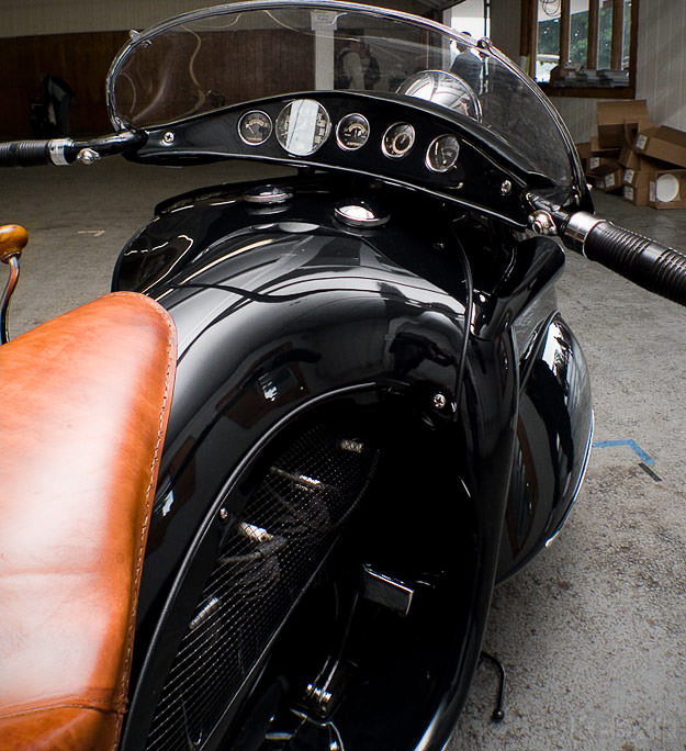
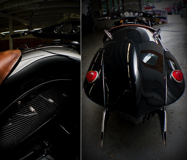
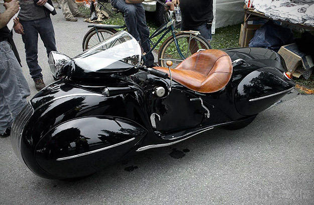
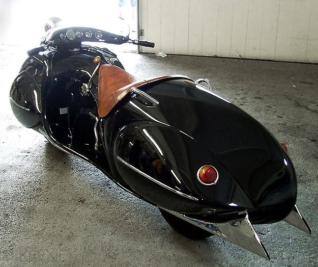
Sitting low on 10-inch wheels, its chassis was fully enclosed in a gracefully shaped shell that began with a rounded nose and grille similar to a ’34 Chrysler Airflow, and ended with a boat-tail reminiscent of the Auburn Speedster. Between, was a Coke-bottle-shaped body with a low seat for a single passenger.
By virtue of its small wheels, some people have referred to Courtney’s creation as a “scooter.” But its big four-cylinder engine makes it hard to think of the creation as anything less than a true motorcycle, since it is powered by a 1,300cc four-cylinder engine from a Henderson Model KJ.
The flowing bodywork was shaped entirely by Courtney from steel, using a power hammer. The hidden chassis has a modified Henderson KJ fork in front and a complicated suspension system in back derived from the auto industry. The machine also features hydraulic brakes.
The finished product is so breathtaking that it’s difficult to do it justice in photographs. The graceful curves are seductive, and from every angle, new subtleties appear in the continuity of its form.
The streamlined Henderson was a pure concept vehicle, built to express modern concepts and Courtney’s artistic vision. The conservative motorcycle community of the era did not understand it. References to it in print often used the term “Buck Rogers,” treating it like something out of a futuristic cartoon.
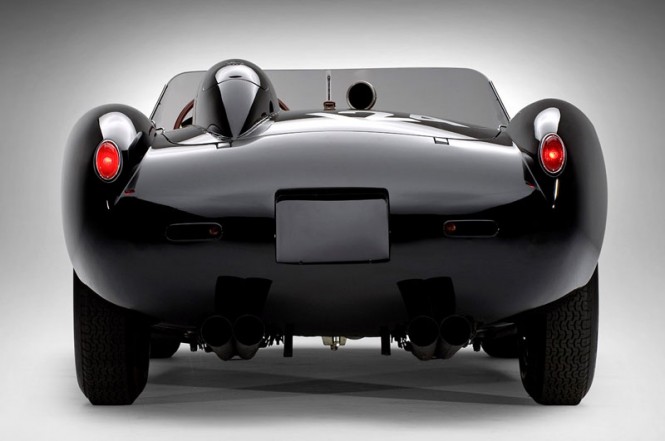
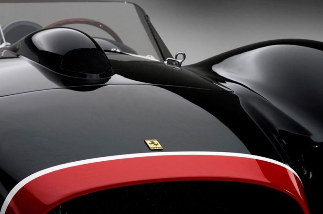
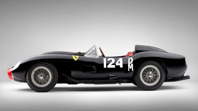
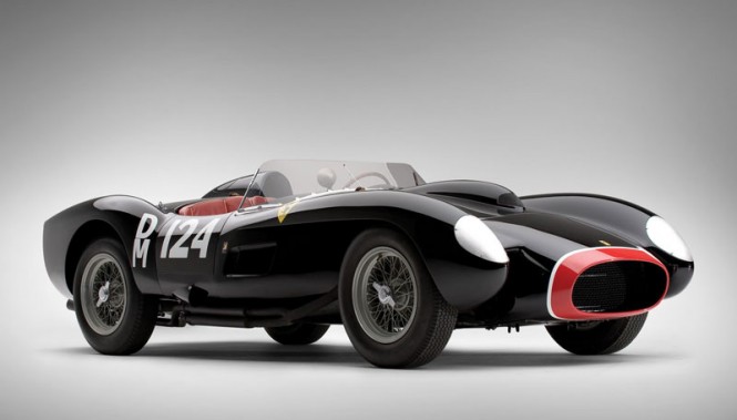
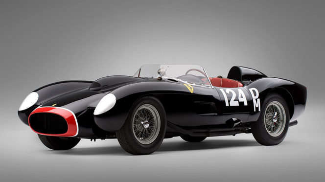
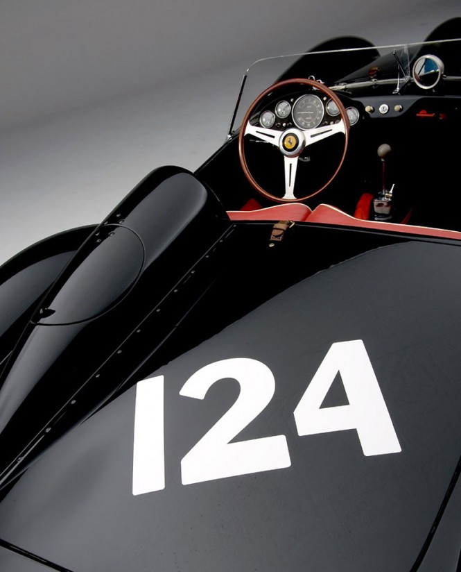
The Ferrari TR, or 250 Testa Rossa, is a race car model built by Ferrari in the 1950s and 60s. These cars dominated their arenas, with variations winning the 24 Hours of Le Mans in 1958, 1960, and 1961. They were closely related to the rest of the Ferrari 250 line, especially the legendary 250 GTO.
In all, thirty-four 250 Testa Rossas were built, from 1956 through 1961. The phrase “Testa Rossa” means “red head.” The most well known, the 250TR, was produced from 1957 to 1958; only 2 factory cars and 19 customer cars were built.
Não sei se gostei ainda… Gosto do formato, mas acho um pouco poluído, complexo, confuso…
First played in 1916, COPA América (American Cup) is the oldest international soccer competition, played every four years in a different South American country from team members of CONMEBOL, the continental governing body of association football in South America. Since 1993, the tournament hosts 10 cities from the continent and 2 invited teams from other countries (like Mexico, Canada, or the U.S.). Next year, the tournament will be played in Chile and the identity has been designed by Brandia Central (who have developed an interesting niche in sports events identities like this).
The strategic work culminated on a strong recommendation: this edition of COPA América would be the start of something new, being the first with a “host-inspired brand”. Instead of presenting an “institutional-based brand” (focusing on COPA America’s tournament), like the previous ones, this edition’s brand would present Chile as proud host, showing its influence on the brand visuals.
provided text
Previous logos, all following the same format. Imagery sources and references.
The Chilean culture was the background for all the creative process: the 5-point star of the national flag, the 8-point star as an old national symbol as well as a reminder of the 8 host cities, the kultrun (ancient tribal drum) design, the human visual representations from folk culture representing 4 values: Celebration, Passion, Surpass and Triumph. In other words, a fan (or “hincha”, in spanish), a heart, two contenders and the most beautiful football move of all — the bicycle kick, aka “Chilena” (Chilean). All of these elements were then revisited through a modern visual approach. Portraying a modern, ambitious and cheerful country.
provided text
Elements. Color options. Logo with tagline.
While it was nice to have consistency throughout the previous tournaments with some kind of flag-leading-to-a-ball structure, all those logos are forgettable and uninspiring. Now, like the FIFA World Cup and other large-scale sports with a lot of wait time in between its editions, the Copa América has a host-specific identity with more flavor, relevance, and potential engagement.
The new logo has plenty of elements and references — perhaps too many — and is rendered in Brandia Central’s signature gradient style. It makes for an intriguing symbol that invites further exploration. I could have done without the four player icons in the logo but if the premise is more-is-more (which it seems to be) then it works. The “Copa América” typography is fine and unassuming while the “Chile 2015” demands all the attention. There is some disconnect between the hard angles of the icon and the overly scripty typography. In application, though, it’s clear that there is a maximalist approach that promotes the combination of all kinds of visuals.
Icons.
I love the icon set, particularly the “chilena” (far right). Not sure about the second one, with the two players bumping crotches.
Host city logo. Host city elements.
The identity starts getting far too diverse here, with the introduction of this type style that feels overly trendy, not in the right way.
Bringing it all together. And again, with more stuff. Brand video.
As a whole, with all the diverse and seemingly disparate elements, the identity comes together quite energetically and there is an overall great texture to the work even if at times you are left scratching your head of why there is so much stuff. More importantly, this identity provides a solid springboard for future tournament identities.
Lembra-se de alguma fotografia marcante que tirou quando criança? Imagine agora que, ao olhar essa fotografia, você se depare com uma pessoa ao lado do seu “eu” mais jovem. Essa pessoa é a versão atual de você mesmo.
Um pouco confuso? A fotógrafa japonesa Chino Otsuka decidiu fazer esse experimento ao se inserir digitalmente as fotografias de infância.
O resultado ficou curioso e muito interessante. Confira: